Did you know 76% of users love minimalist design because it's simple and easy to use? This fact shows how popular minimalist web design is becoming. It also shows how important it is to know how to use it well to keep users interested and to make more sales1. In today's digital world, people want things that are clear and work well. Knowing how to design a minimalist website can really help make your site better.
Minimalist web design is more than just looking good. It's about making your site clear and free from things that get in the way of a good user experience1. By focusing on what's really important, you can make a site that's easy to use and looks good. In this guide, you'll learn about the key parts of minimalist design. You'll learn about using space well and picking the right fonts to make your websites stand out and have a big impact.
Now, let's explore the best ways to design minimalist websites. We'll make sure your websites are not only stylish but also focused on the user.
Key Takeaways
- • Understand the core principles of minimalist web design for better user engagement.
- • Utilize whitespace effectively to enhance visual appeal and clarity.
- • Focus on essential elements to avoid distractions and maintain usability.
- • Employ good typography to improve readability and user experience.
- • Implement fast-loading pages to keep visitors engaged and boost SEO rankings.
- • Choose a limited color palette to create a soothing visual environment.
The Definition of Minimalist Web Design
Minimalist web design is all about simplicity. It removes unnecessary items to make websites easier to use. Today, many brands use this style to show off their clean and simple designs.
Understanding Minimalism in Digital Design
In digital design, *minimalism* means cutting down on complexity. This makes it easier for users to find what they need. A clear design helps users focus on what's important.
Most users, 85%, like websites that are easy to navigate. Minimalist design helps users solve problems 60% better2.
Key Characteristics of Minimalist Websites
Minimalist websites are known for their clean look. They use lots of white space, simple fonts, and a few colors. About 75% of these sites stick to a few colors and fonts to keep things consistent2.
Most, 90%, of these sites have one main goal and ask users to do one thing. This makes it clear what to do next2. Websites with a minimalist design load up to 40% faster than busy ones2.
Also, 95% of minimalist sites are designed to work well on all devices. This makes the user experience better no matter where they are2.
Benefits of Minimalist Web Design
Minimalist web design has many benefits for user experience and site performance. Websites with too much clutter can be frustrating and cause people to leave. By choosing minimalism, your site can become efficient, engaging, and keep users coming back.
Improved Loading Speed
One key advantage of minimalist design is faster website loading. Around 40% of users leave if a site takes more than three seconds to load3. With fewer elements, sites load quicker, meeting the demand for fast loading websites. This is especially important in 2024, when mobile traffic is dominant, making minimalist design both appealing and strategic4.
Enhanced User Experience
Minimalist web development makes sites easier to use. It simplifies navigation, letting users focus on what's important. A well-designed minimalist site can lead to better engagement and higher conversion rates3. In today's world, clean and simple designs are more likely to keep users coming back for a seamless experience4.
| Benefits | Description |
|---|---|
| Faster Load Times | Minimalist designs lead to quicker loading speeds, reducing user abandonment. |
| Reduced Bounce Rates | With faster loading and easier navigation, users are less likely to leave your site. |
| Better Engagement | Enhanced user experience allows for improved interaction and satisfaction. |
| Higher Conversion Rates | Clean designs facilitate clearer calls to action, boosting conversion chances. |
Minimalist design also makes sites more accessible for people with disabilities. It's a cost-effective way for businesses to simplify maintenance and meet sustainability goals34.
Best Practices for Designing Minimalist Websites
To make a minimalist website work, you need to follow some key steps. Learning how to use space well and focusing on what's really important can make your site better. This approach improves how users feel and see your design.
Utilize Whitespace Effectively
Whitespace, or empty space, is a big deal in minimalist design. It brings balance and makes important stuff stand out. Google uses it to make their logo and search box pop, keeping their look fresh2.
Apple's site also uses whitespace to show off their products in a clear way2. This smart use of space grabs users' attention, making them want to explore more.
Focus on Essential Elements Only
Minimalist design is all about being simple and useful. By focusing on the basics, your site is easier to use and understand. This design philosophy puts content first, making sure it's clear and easy to get5.
Also, keeping navigation simple cuts down on distractions. This lets users focus on what's really important6.
Typography: An Essential Component
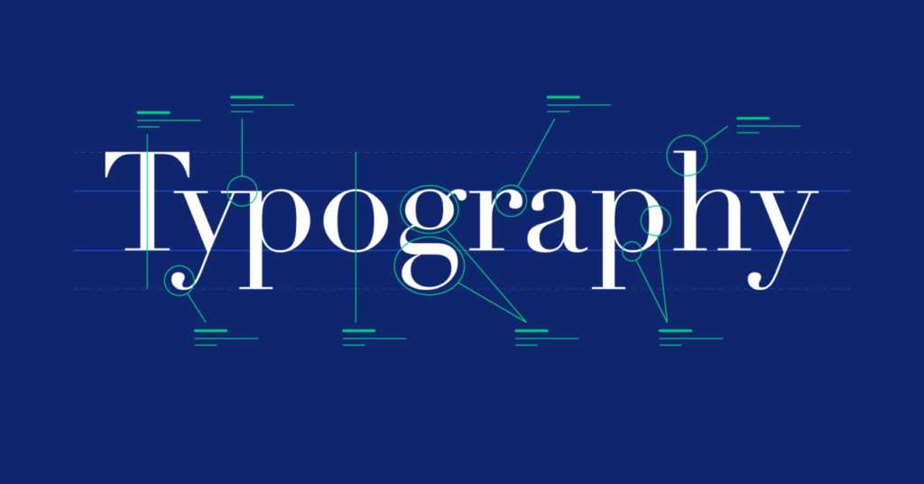
Typography in web design is more than just looks. It shapes how users feel and see content. In minimalist design, every font choice is key. A good typography plan makes reading easy and keeps things simple.
Choosing the Right Typefaces
Choosing the right typefaces is crucial. Serif fonts like Times New Roman add a classic feel. Sans-serif fonts, such as Helvetica, bring a modern look. Fonts like Montserrat and Open Sans are great for websites because they're easy to read7.
Using the same typefaces everywhere makes your site look better. It helps users find their way and understand the content7.
Font Size and Accessibility
Accessibility in typography is a must. The right font sizes help everyone, including those with vision problems, read easily. It's best to use a font size of 1em and a line height of 1.5em-1.75em for the best reading8.
Make sure there's enough space around text. This makes your design look better and improves the user's experience8 and7.

Effective Use of Colors in Minimalist Design
Colors are key in minimalist web design. They often use monochromatic schemes for simplicity and clarity. Neutral colors like white, black, and light beige make sites look professional and easy to use9.
These colors also help build trust and reliability with users9.
Monochromatic Color Schemes
Monochromatic schemes use different shades of one color. This creates a clean and appealing site. It focuses on important features without overwhelming the viewer.
Using these schemes can also reduce bounce rates, improving user engagement10.
Strategic Use of Accent Colors
Accent colors are used to highlight important areas without disrupting the design. High contrast between text and background is key for readability. It guides users to important features while following accessibility rules9.
Testing different colors helps designers see how they affect users. This ensures the design connects with visitors9.
| Color Type | Description | Examples |
|---|---|---|
| Neutral Colors | Simple and unobtrusive, these colors set a calm tone. | White, Beige, Gray |
| Accent Colors | Used to draw attention to essential elements. | Pale Blue, Soft Green |
| High Contrast | Helps readability and directs user focus. | Black Text on White Background |
| Consistency | Reinforces brand identity through color choices. | Using the same palette throughout the site |
Responsive Design and Compatibility
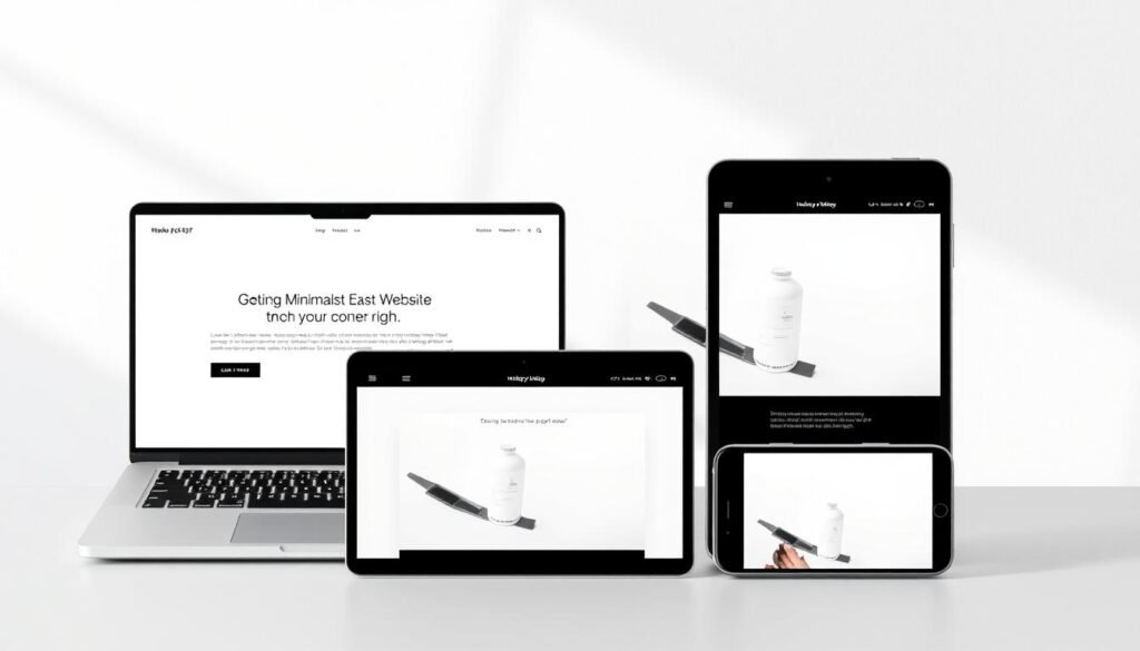
In today's world, responsive web design is key for a great user experience on all devices. With more people using mobiles, it's crucial to start with mobile layouts. This makes websites work well on all screens, big or small.
Learn more about responsive design in Ethan Marcotte's article here11.
Importance of Mobile-First Design
Nowadays, having a responsive website is a must. It needs to work on many devices with different sizes and shapes. A good responsive design uses fluid grids, images, and media queries12.
Using Scalable Vector Graphics (SVGs) helps keep images looking good on any screen. Flexible layouts are essential for working well on many devices. This makes your site great on all tech platforms11.
Designing with a mobile-first approach keeps your content looking good and working well everywhere. This is a smart way to keep your website compatible on all devices13.

Implementing Grid Layouts for Clarity
Grid systems in web design are key to making content layout clear and improving user experience. They help create organized content that looks good and is easy to find your way around.
Benefits of Grid Systems
Grid systems bring many benefits to web design. They offer a structured way to design, making it easier to handle complex layouts with rows and columns14. This structure makes navigation and finding information easier for users14.
Using a grid system makes your content look better and more unified14. It's best to use 12 columns on desktops, 8 on tablets, and 4 on phones to keep things organized15.
Examples of Grid Layouts in Use
Many websites use grid layouts, from portfolios to blogs. They make it easy to see posts and images. For blogs, block grids are great for showing off full-width images15.
Modular grids use a checkerboard pattern for engaging designs on any device15. These layouts adjust well to different screen sizes, giving users a smooth experience14
The Role of Imagery in Minimalism
In minimalist web design, picking the right images is key. You can make your site look great with images that match your brand. Big images, like hero shots, grab attention without cluttering the page. It's important that images add value, not just look good.
Good images help users navigate and enjoy your site. Minimalism has been around for over 50 years, focusing on simplicity and ease16. Most minimalist sites use simple patterns and textures, with 96% using flat designs17. This mix of images and text lets users focus, making the site feel calm and clear.

Using images wisely makes your site easy to use and fast to load. Minimalist sites often have fewer features but focus on what's important, with 87% of them using visuals to enhance text17. Good images can also help sell more, showing how looks and function go hand in hand in minimalism16.
| Element | Importance in Minimalism | Example |
|---|---|---|
| High-Quality Imagery | Enhances user engagement | Danilo De Marco's design |
| Flat Patterns and Textures | Supports visual simplicity | 96% usage in minimalist designs |
| Monochromatic Palettes | Minimizes distractions | 95% in analyzed websites |
Creating Symmetrical Designs for Aesthetic Appeal
Symmetrical designs in web design grab users' attention and offer a stunning visual experience. Designers use reflection, rotational, and translational symmetry to create focal points and stability18. Reflection symmetry mirrors elements across a central axis, creating balance that calms the viewer18. Rotational symmetry, like flower petals, adds movement and action to designs18.
Translational symmetry keeps balance, especially in layouts, making navigation smooth18. While symmetry brings order, asymmetry adds visual interest and hierarchy18. Knowing these concepts boosts the beauty of minimalism and meets user needs.
Minimalist designs rely on negative space to highlight images and key elements19. This approach not only attracts attention but also makes the design feel organized, encouraging user interaction and easy navigation19. Grid systems, like those from Elementor, help achieve symmetry and balance in designs19.
The beauty of minimalism comes from carefully chosen colors and arranged elements. A simple color palette, with two to three colors, keeps the design cohesive without being too much20. This careful selection, along with thoughtful graphics and typography, improves the user experience while sticking to minimalist design principles20.
| Type of Symmetry | Description | Common Usage |
|---|---|---|
| Reflection Symmetry | Mirrors images across a central plane. | Used for harmonious layouts. |
| Rotational Symmetry | Positions elements around a central point. | Effective for dynamic visuals. |
| Translational Symmetry | Repositions elements while maintaining orientation. | Common in tiled backgrounds. |
| Asymmetry | Lacks symmetry, introducing visual variation. | Enhances engagement and interest. |
Conclusion
Mastering minimalist web design means you're using a modern approach. This approach benefits both your users and your brand. It focuses on the most important elements, uses whitespace well, and makes sure your site works on all devices.
Studies show that 40% of users leave if a site takes more than three seconds to load. This shows how crucial speed and simplicity are in your design21.
Minimalist design also makes your site work better on phones and tablets. Since 52% of mobile users surf the web on their phones21, this is very important. A clean, fast site grabs attention and keeps users engaged, which can lead to more sales.
Experts say 11 key practices can make a minimalist site both attractive and useful5.
By using these strategies, like adding micro-interactions and making navigation smooth, you meet today's digital audience's needs. Minimalism makes the user's experience simpler and your site more effective. As you improve your design, look at Apple and Dropbox for inspiration522.


